 Desiree Braido
Self-Initiated Brand · Identity · Packaging · Brand Guide
ice-n-beans
We believe a good day can turn on something small: a scoop, a cup, and someone who knows your name.
- Role
- Creator · Brand Designer
- Status
- Complete brand
- Category
- Food & Beverage · Retail
- Scope
- Logo · Color · Packaging · Guide
- Deliverables
- 6 pint labels · coffee bag · brand guide
My role
My own concept for an ice cream and coffee shop, built as a complete, ready-to-launch brand: two birds sharing one mark, a caramel brand color, a flavor color system, pint labels with a quote on each, coffee packaging and a full brand guide.
Two birds, one mark
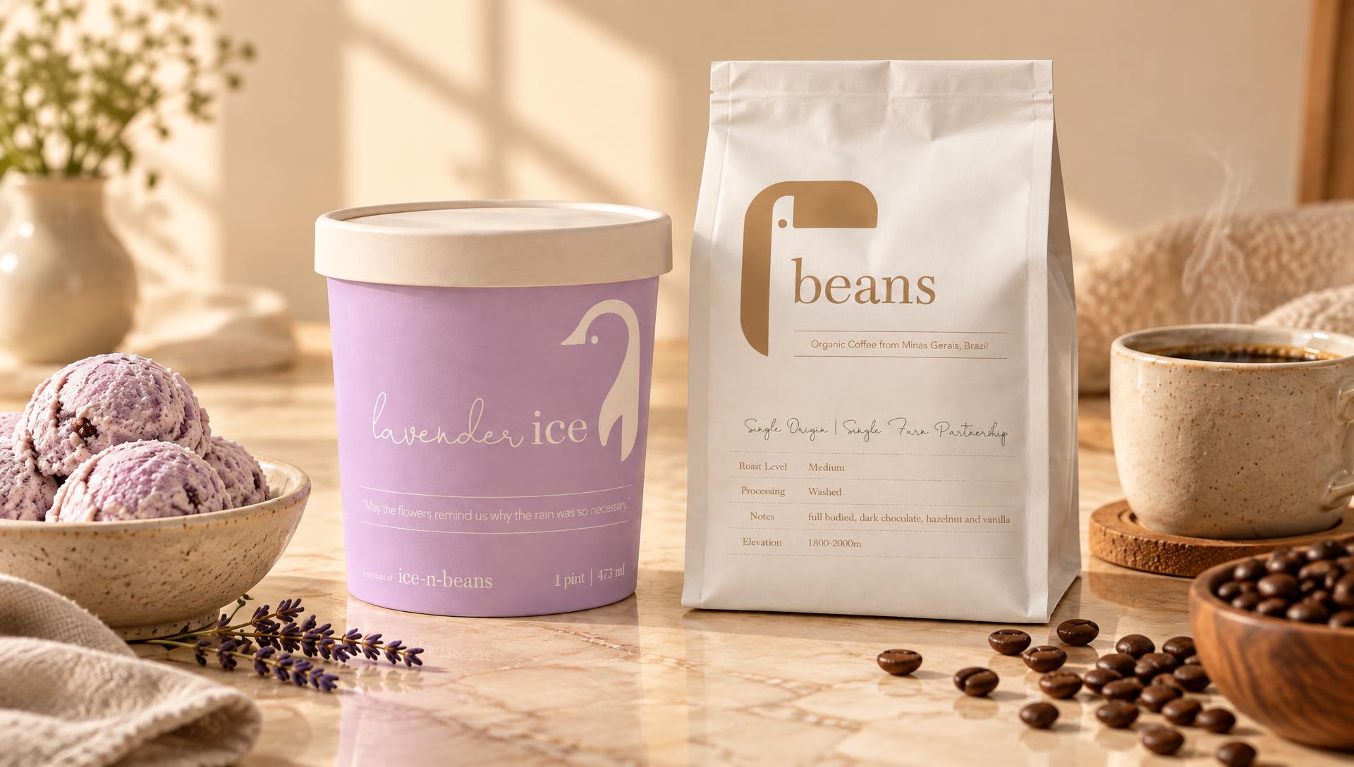
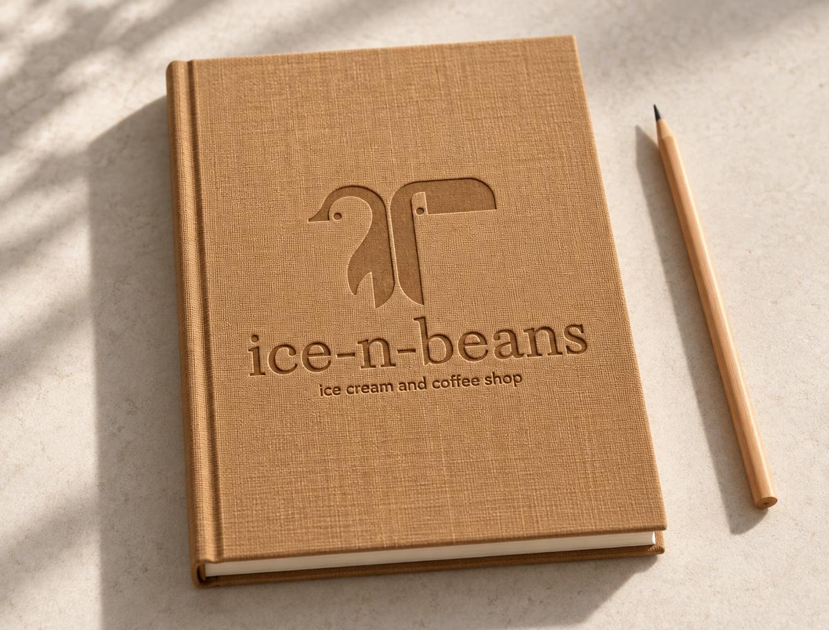
The logo pairs two birds: the ice-cream bird for the pints and the toucan for the coffee. Together they form one shared mark, so each product line has its own character while the shop reads as one place.
Caramel is the brand color: logo, name, buttons and borders. The logo is never recolored.
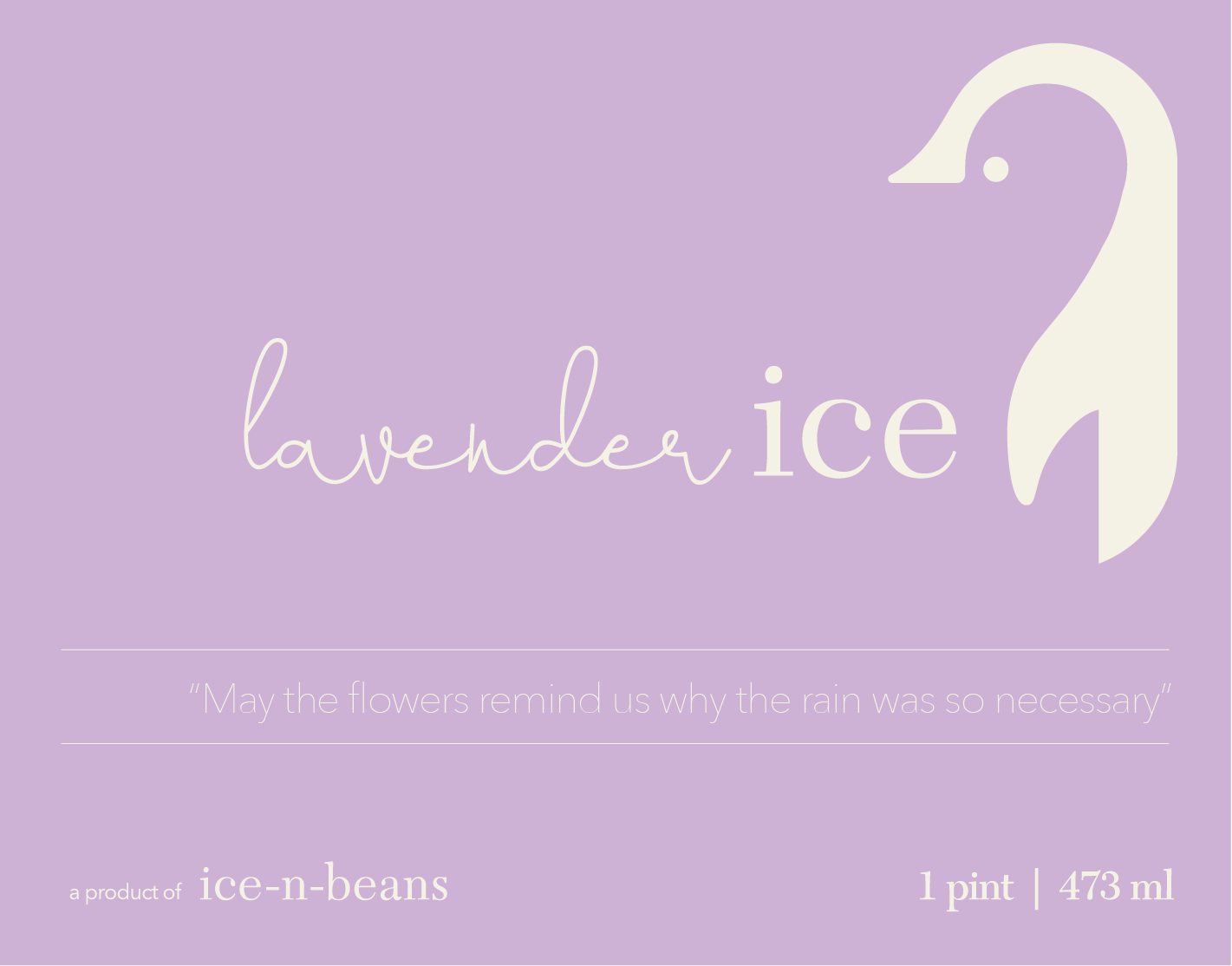
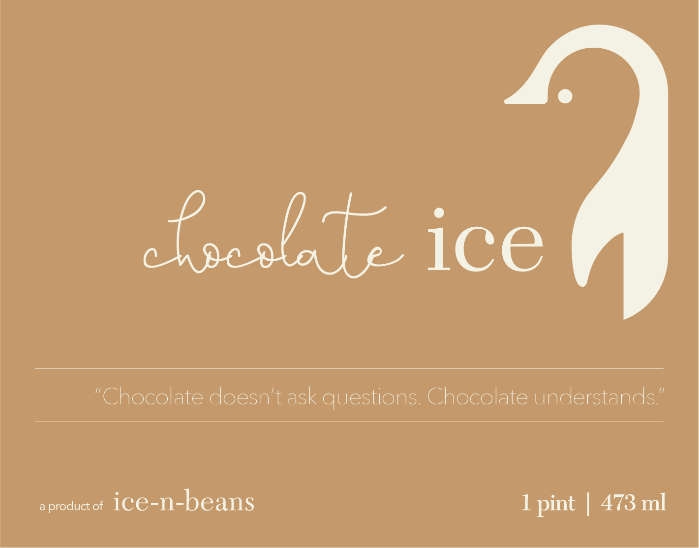
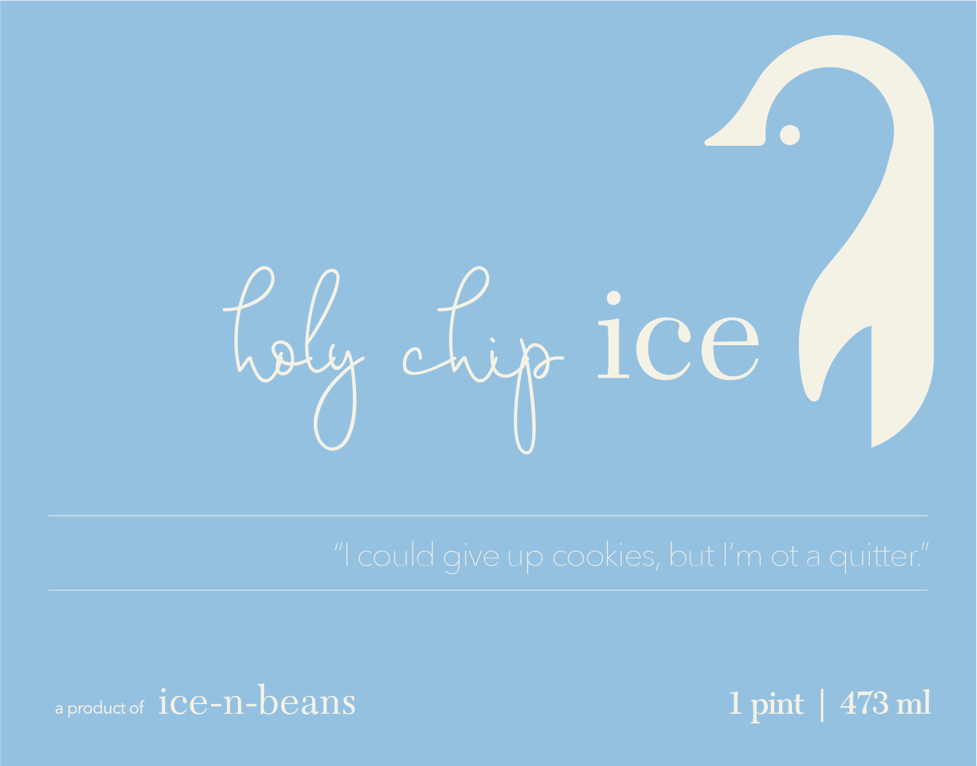
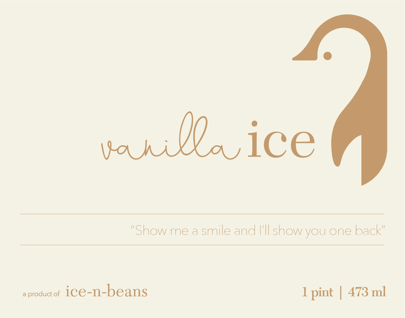
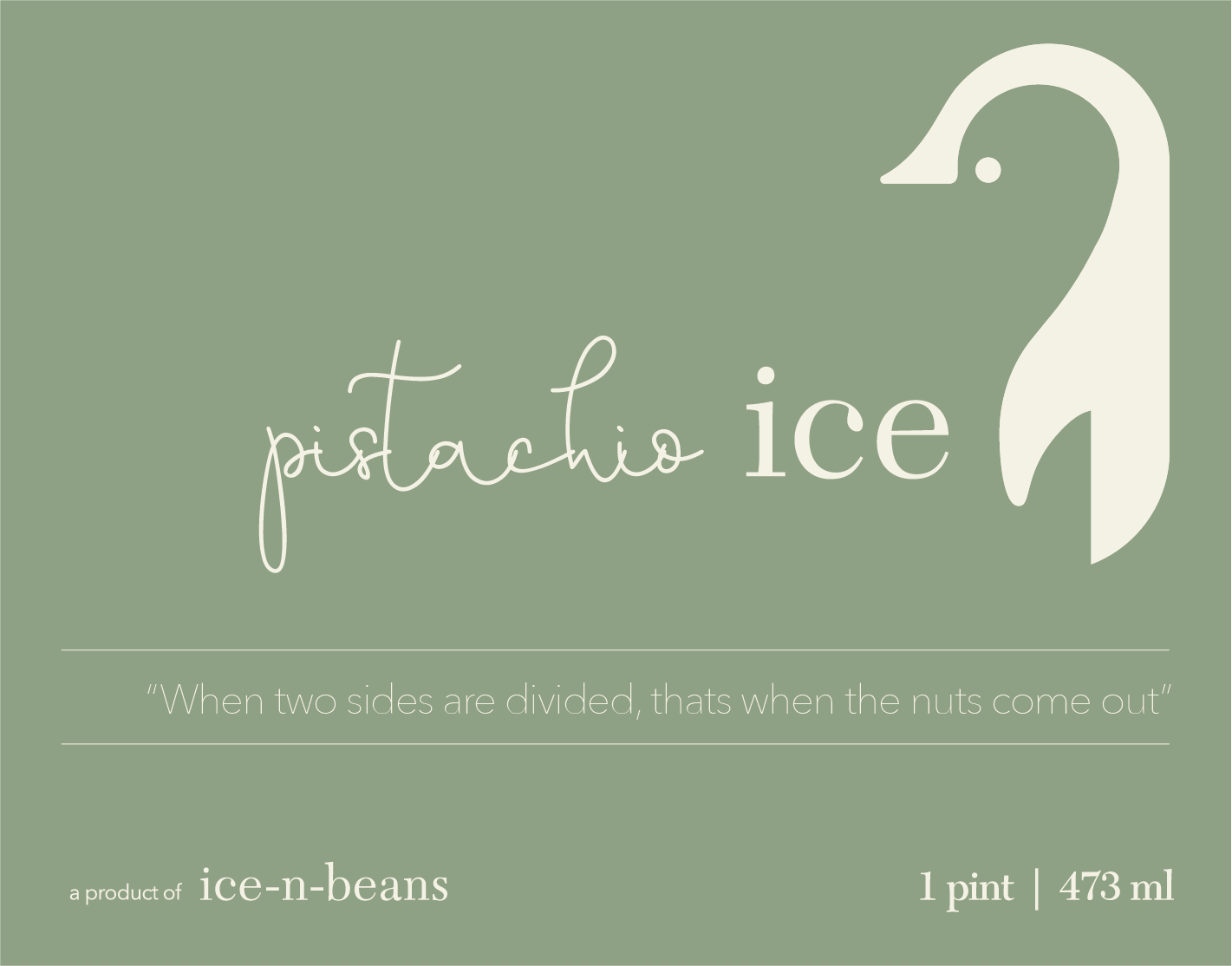
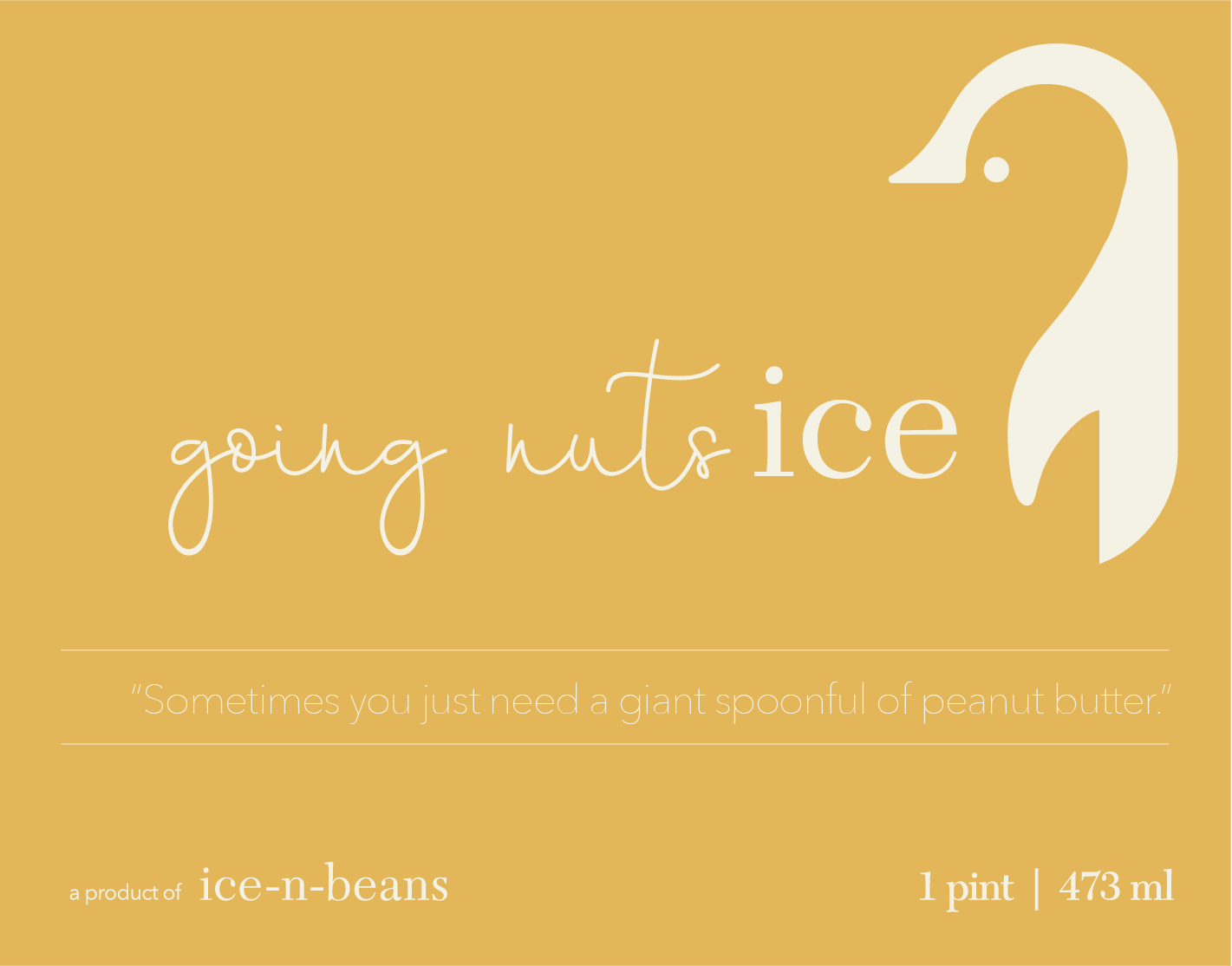
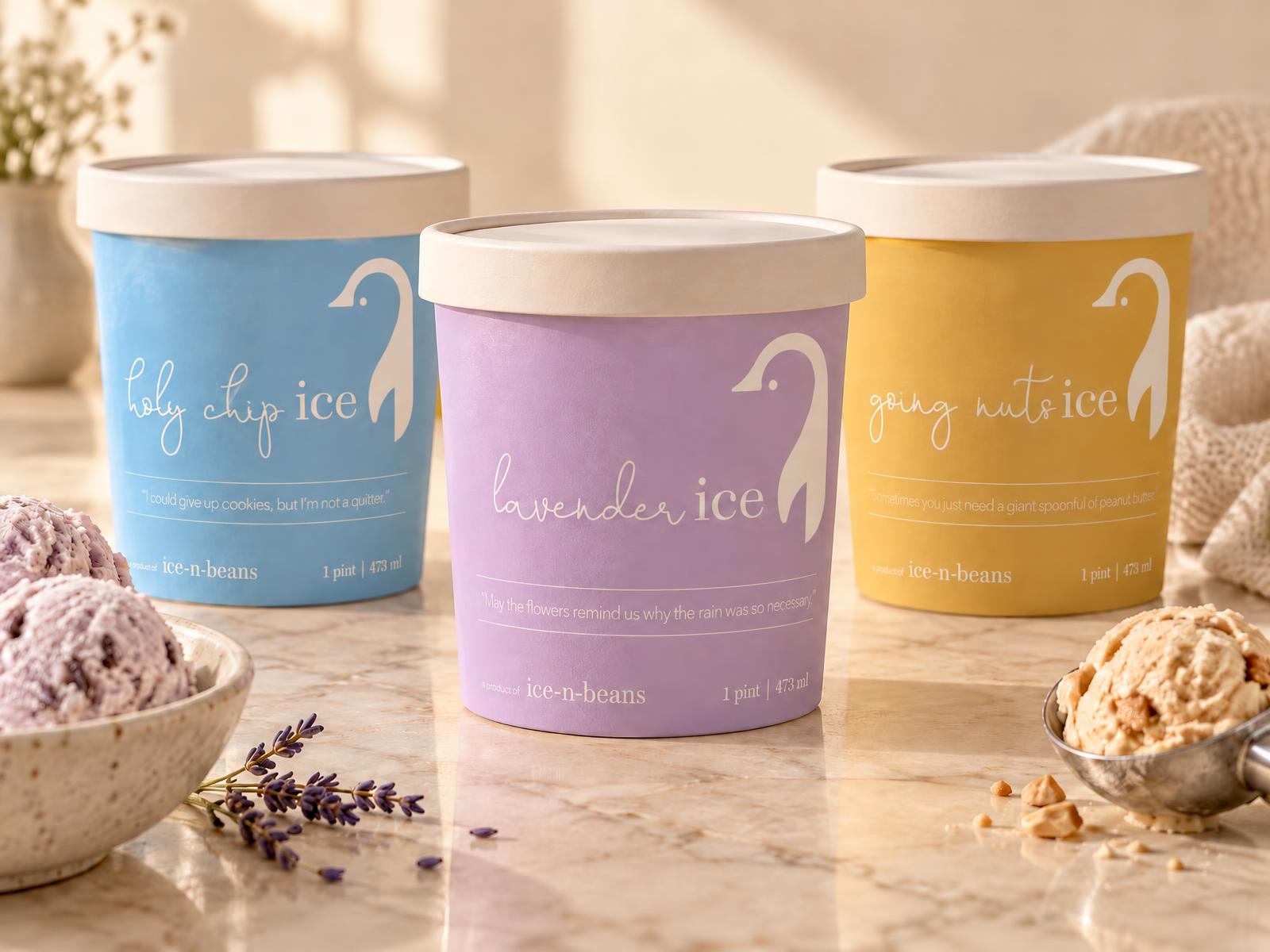
Every pint gets one color, one bird and one quote
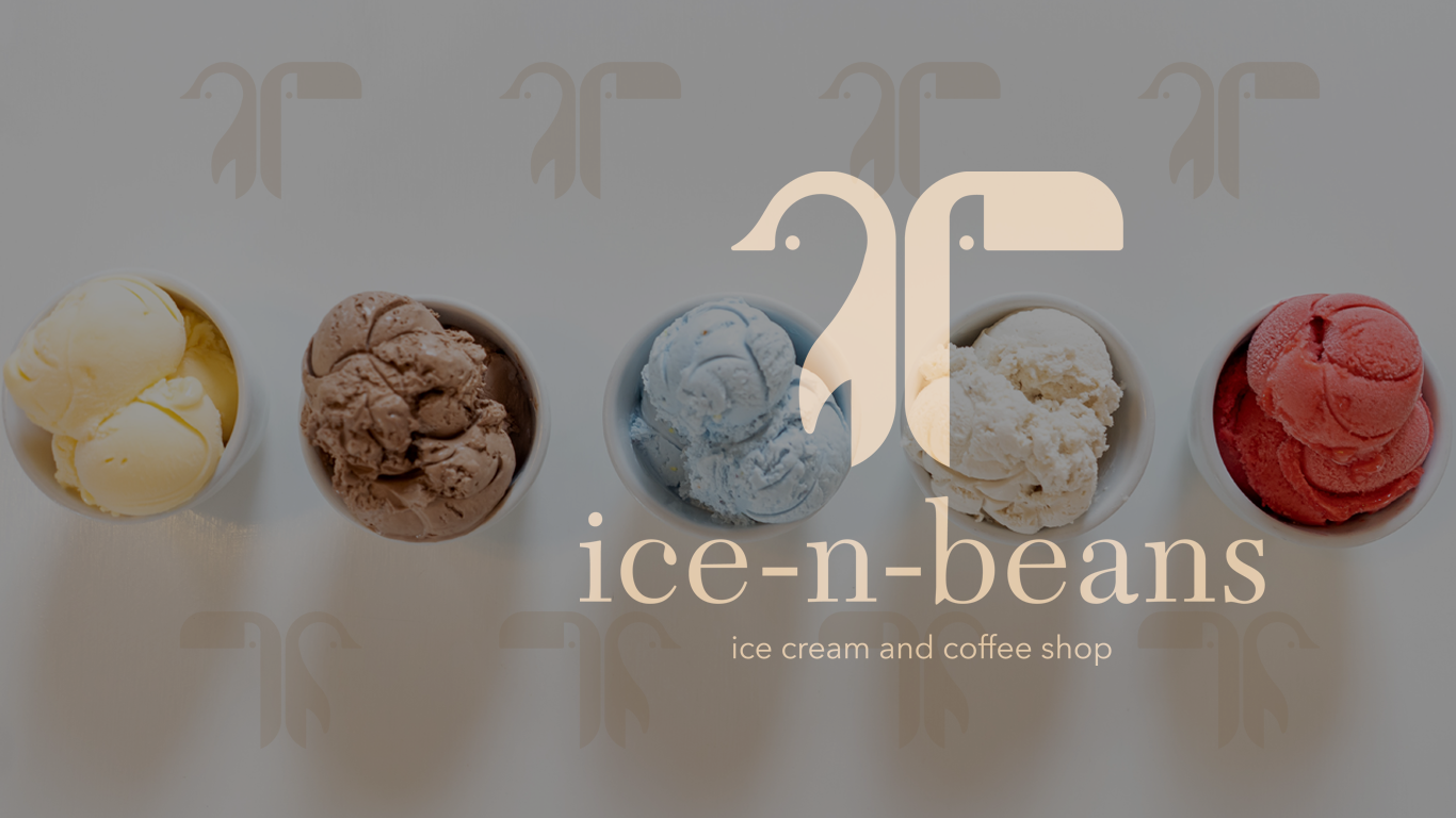
Each flavor owns a color from the flavor palette, and every label carries a line meant to make you smile, like holy chip's "I could give up cookies, but I'm not a quitter."
Know the source
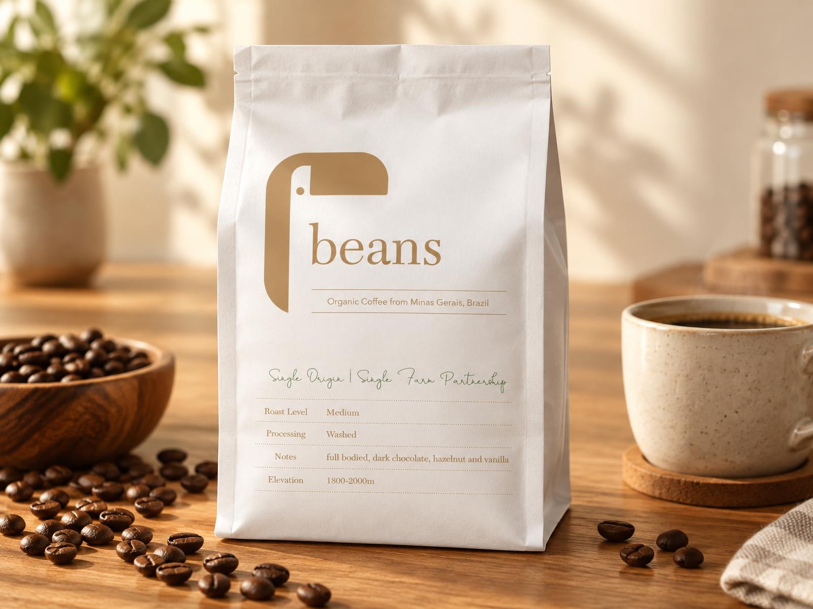
The coffee comes from a single farm partnership in Minas Gerais, Brazil. The bag puts that story first, with roast, process, tasting notes and elevation set out plainly.
In the world
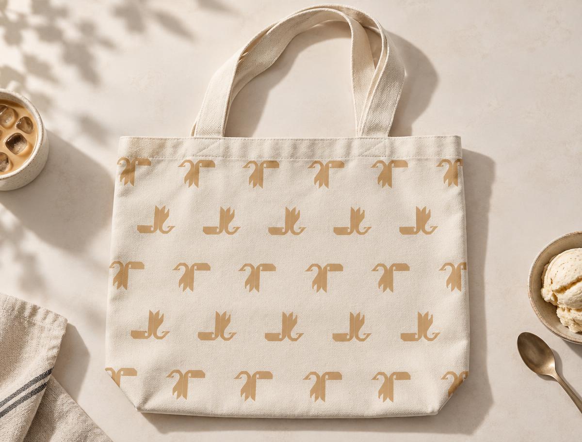
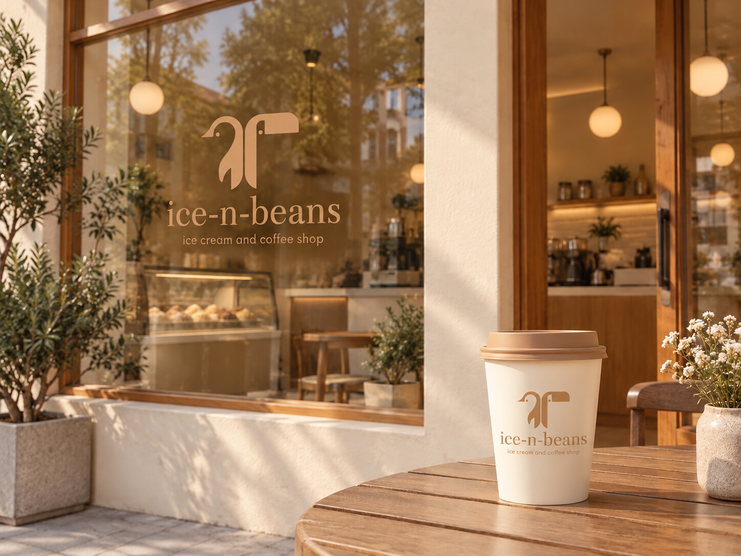
Concept photos showing how the identity lives on pints, cups and the storefront.
Brand guide
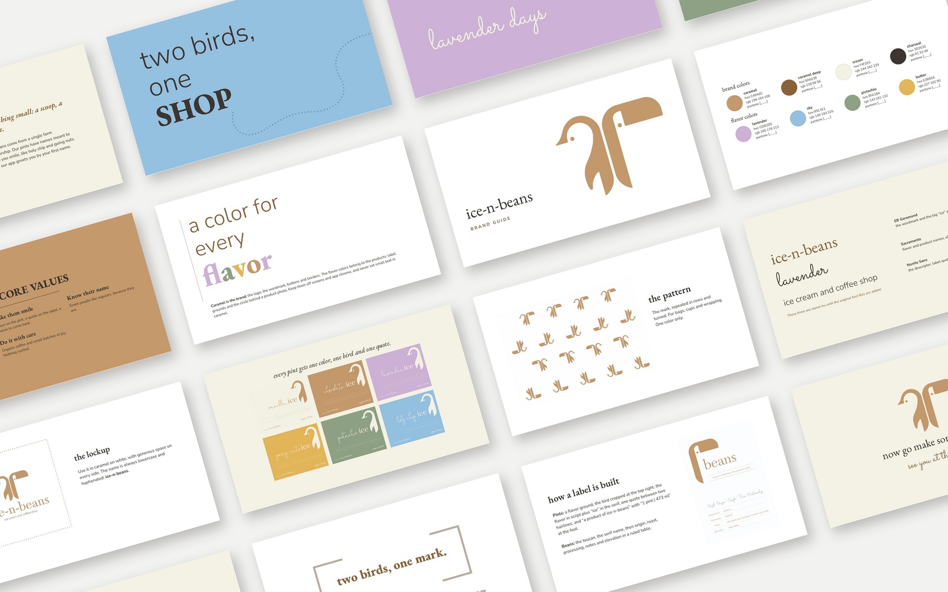
A complete guide to the identity: the two-bird mark, brand and flavor colors, typography, packaging, pattern and voice. One system that keeps every pint, cup and touchpoint feeling like ice-n-beans.